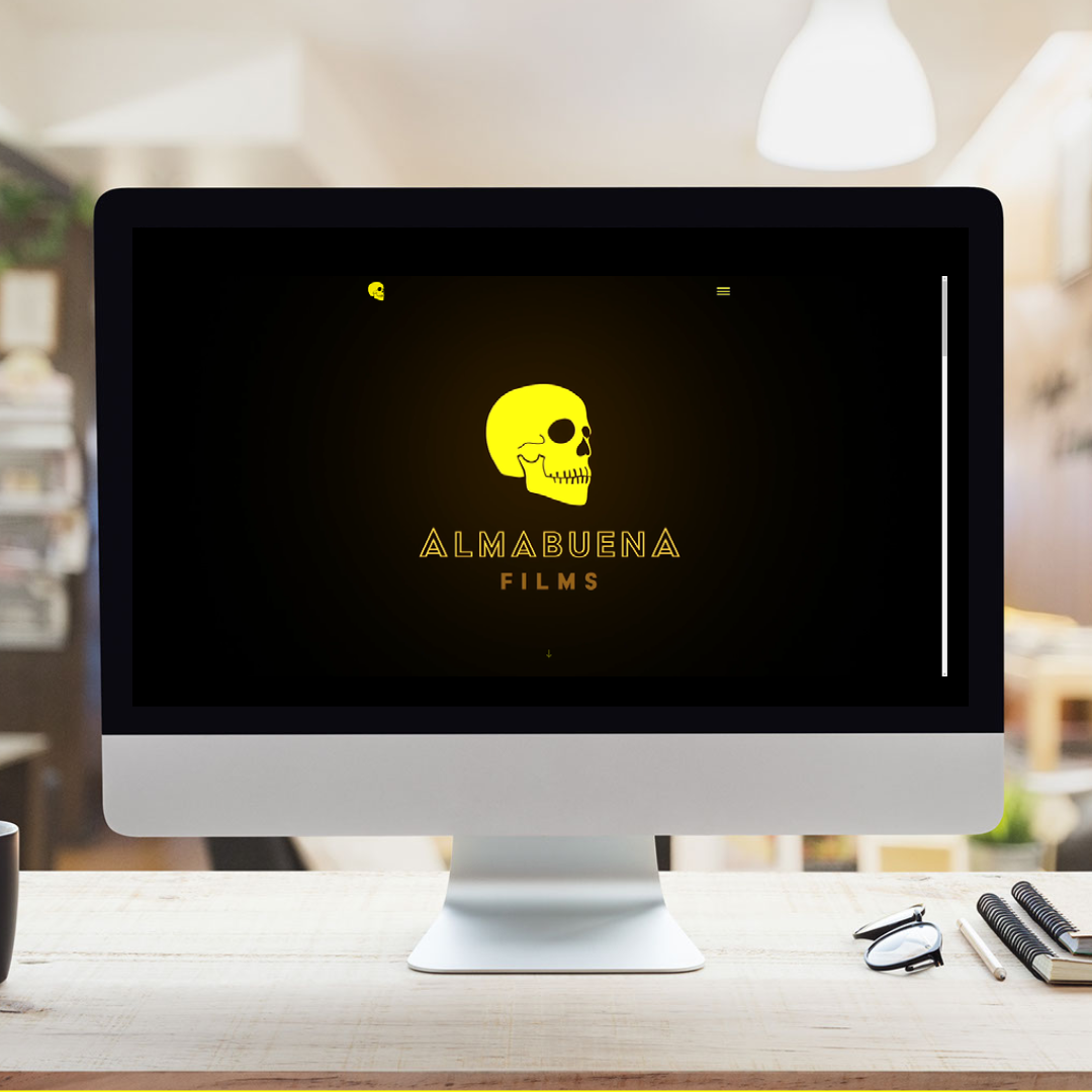
At Almabuena Films we believe that films are meant to be shown. Especially in a movie theater, but any channel can potentially be suitable to showcase your work. One of the channels where our films are displayed is our website. For us, it was quite important to find a company that understood how to make websites that are both attractive to the eyes of our audience and to the bots of search engines. We contacted Volcanic Internet and trusted its all-around team to help us on our mission to showcase our work properly.
Searching for references
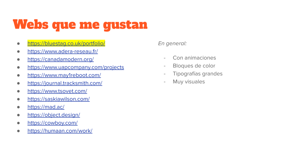
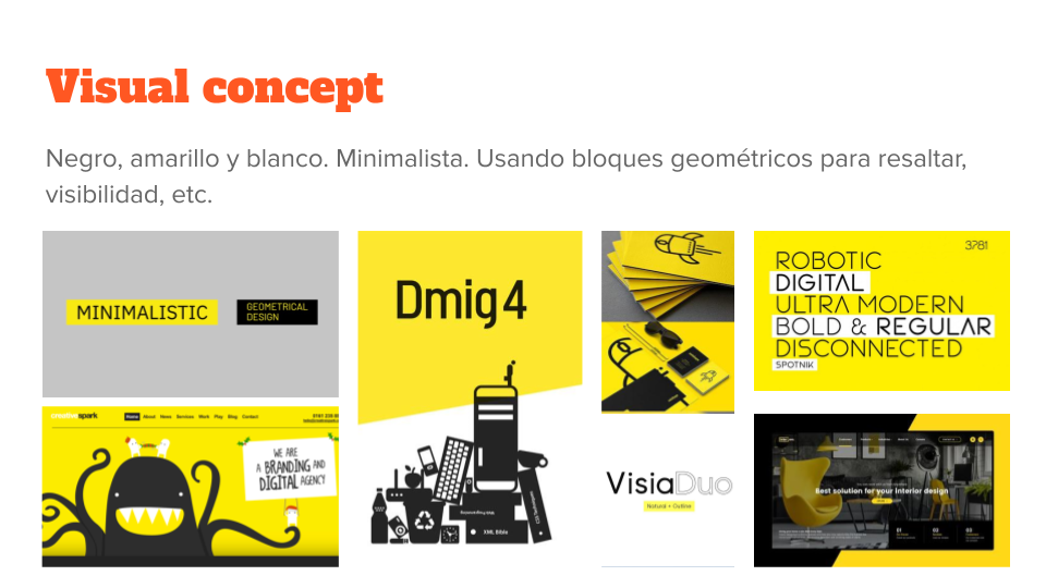
In order to set the project in motion, we needed to communicate the basis of our brand and our requirements in a structured manner, so the Volcanic Team could work their magic. We put together a deck with visual references and links to other websites. This made us ask questions to ourselves about our brand and our vision, like, for instance:
- What is the personality of Almabuena Films?
- Looking for references on competitors' websites, what do they have in common? Why do we like them? What we would do differently?
Defining the purpose
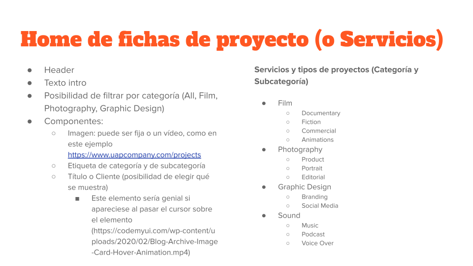
However, before contacting them, we took the most important step in this process: defining the purpose of the website, and from every page. This will help you make decisions, and also know which content you should include. Let's take as an example the home that collects all of our Projects. As mentioned, for us important to show by doing, and we thought that the best way to list our capabilities as a production company was to gather all our projects and assign them Categories and Sub-categories, which in fact are our services. We also defined the kind of information that this page should include, and the possibility to filter by Categories.
The challenge to making it attractive
The challenge for Volcanic was to fit all that info and requirements and make it attractive and readable. Since we already made our homework and reviewed other websites to find features that were appealing to us, we were even able to put together a simple draft of the structure of every page (also called a wireframe).
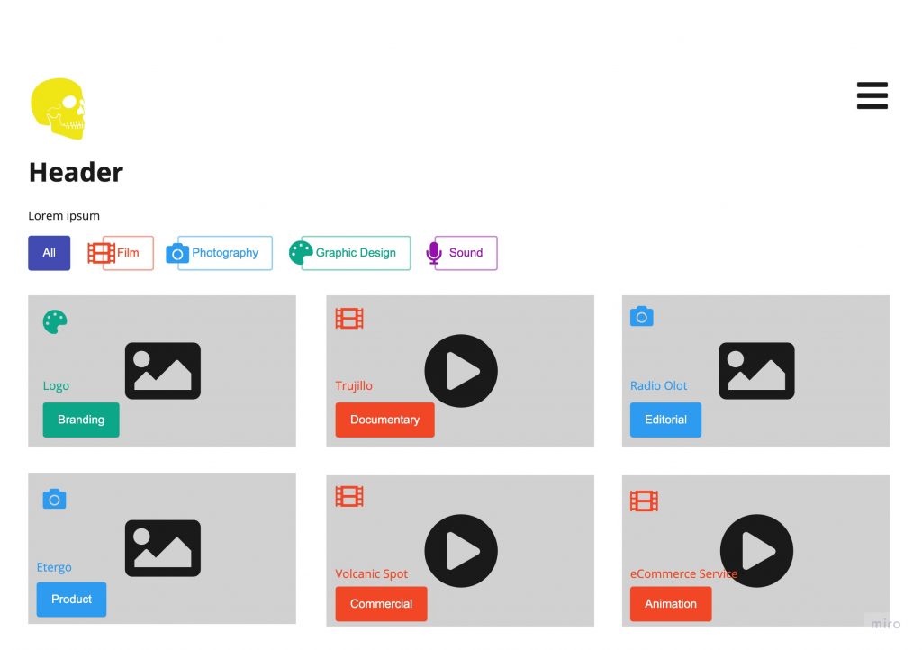
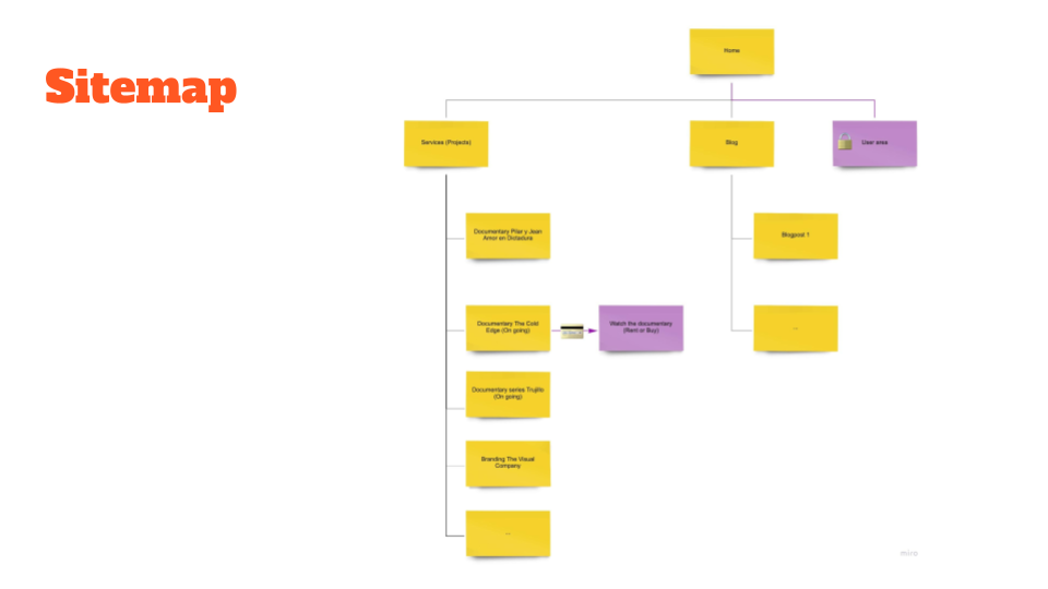
We repeated this process with every page we needed. It was a great exercise for us to understand our brand better and find out what was aligned with it. With all these inputs we were able to create a sitemap, which is a table of contents from your website. Defining this is key for users (and bots) to find what they are looking for.
We were lucky enough to have Almu Tabernero on the team, which used to be a project manager and knows her way through web development. If you don't count on an "Almu" in your team, then you need to find a specialist. Somebody who can advise you on how to transform your needs into a website that converts, and that can help you make the right choices. And more importantly, somebody who can translate the technical jargon into a language you can understand. In our case, we were already collaborating with Volcanic as content creators and our communication was very good, so it was a no-brainer.
Working with Volcanic
Volcanic is a company that operates very well remotely. Even before The Pandemic, the team was working efficiently from several countries in the World. They use Asana as their project management tool for the last 10 years, and that allows them to have a better overview and control of the projects they are managing. That also helps with establishing a more effective communication channel.
Our first kick-off meeting was a video call between The Netherlands, the UK - where their designer, Carla Costa, lives- and Spain -with the technical team. After everyone understood what was needed and what to expect, Carla started working on the first designs. Soon after that, we received a link to Sketch to review the pages and add our feedback. It was exactly what we expected and there were very few comments on the work from Carla.
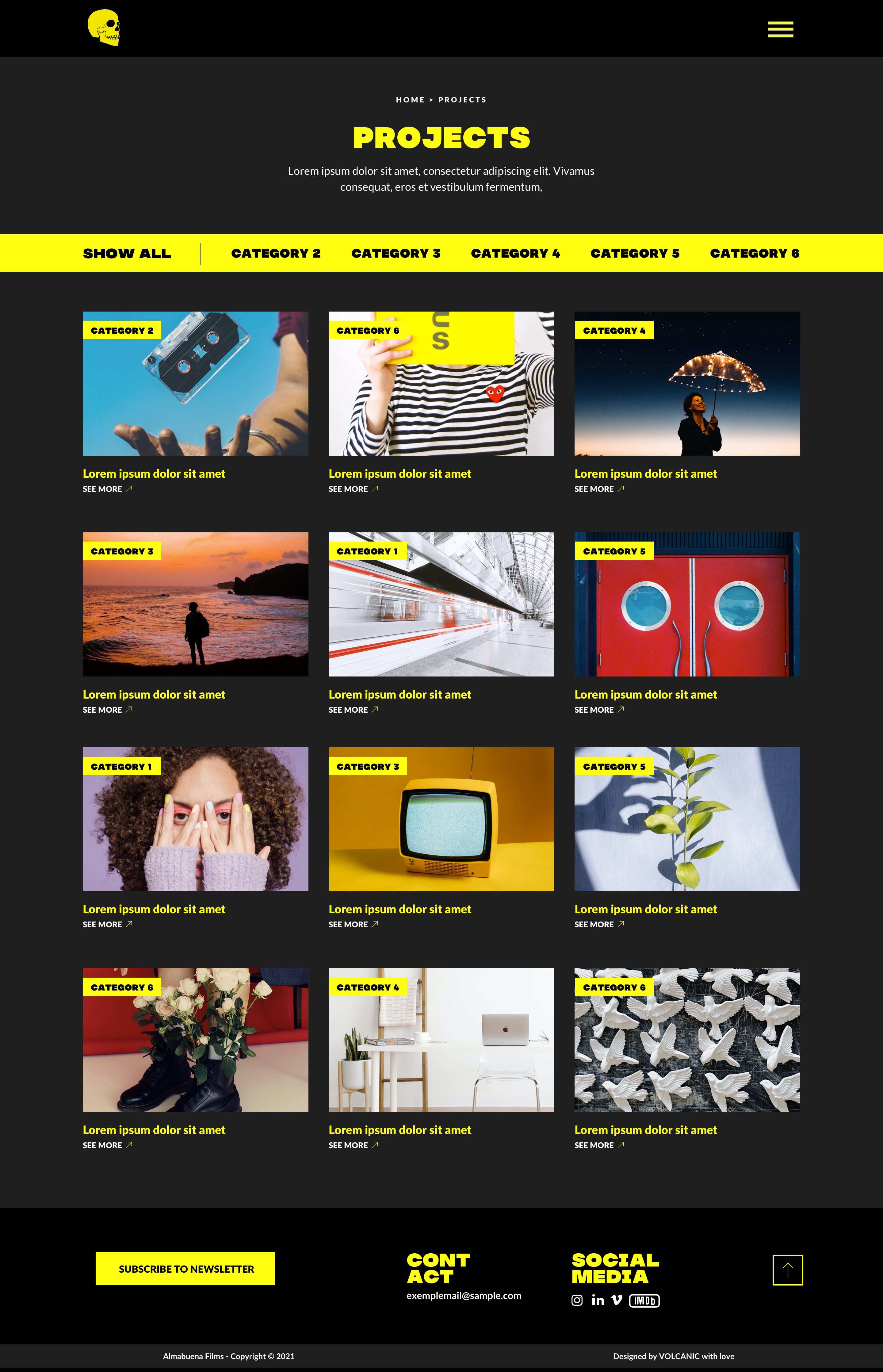
Starting the development
Once all the designs were approved by us, the developers started building the pages on WordPress. We chose this platform for many reasons, being the main one its easy interface for content management. Updating any page, changing any picture, or adding a new project shouldn't be a painless experience. Coordinated by Albert Torres, the project manager for this project, the team put together our website. We were able to try each page, and add our own content as a test, both on desktop and on our phones. The team worked to solve some minor bugs. Then, our website was ready to be launched in May this year. After several months of uploading content to the web, we couldn't be happier with the result and with our choice to trust in Volcanic.
